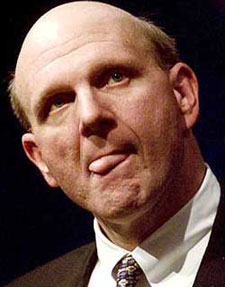
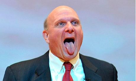
aNewDomain.net — Our John C. Dvorak has something to say about Microsoft CEO Steve Ballmer’s tongue. He hates it. He hates Miley Cyrus’s tongue, too, but for a different reason. Here’s why — and why it matters.
You can tell when the media, analysts and everyone in-between dislikes you. Just look at the pictures they run as stock photos of you.
And I am not talking about always-hateful little blogs or grudge sites. I’m talking about major news outlets. Check out my collection of news photos capturing Steve Ballmer’s tongue to see what I’m talking about.
Microsoft CEO Steve Ballmer wins the award for having the most crackpot photos used to depict him by the media. Just do an image search on “Steve Ballmer.” The results are incredible.
Ballmer, of course, brought this on himself by making goofy faces, running around on stage like a maniac, wearing sweat-stained dress shirts, making outrageous comments and pretty much acting clownish whenever he has the opportunity. Ballmer also has acted like a bully, which is not endearing.
After a while, the public turns on you. And the public includes news editors and reporters — as well as analysts and venture capitalists.
This all shows up in the media in the form of highly-unflattering pictures — they are the target of hate. Ballmer probably should have retired five or six years ago before it came to this.
In the process of attracting attention, a set of tongue pics emerged and began to be used by a lot of media outlets as the portrait of Steve. It was incredibly insulting but, in an odd way funny, too. So let’s look at which media outlets use which horrid Ballmer pics. And which ones focus on Steve Ballmer’s tongue.
As far as I know, nobody so far has made a compilation of all the insulting photos. So consider this only a small, canonical collection of tongue pics. It’s fair warning of what can happen to a CEO who is not circumspect.
Here are the classics.
Here’s the first sample. It’s the classic — and it’s appeared in such media as The Huffington Post, the Inquirer, Business Insider, NBC Bay Area and countless other blogs. It’s a creepy picture, and all journalists using it as “a picture of Ballmer” should be ashamed of themselves.

Below, see this pic of Steve Ballmer’s tongue. Although not as popular, it has also shown up as the picture of Ballmer in The Huffington Post and the Business Insider. Digital Trends included it with a gallery of wacky pictures of Ballmer.

Below, I included a rare pic. I’ve only found this photo of Steve Ballmer’s tongue on Lifelibertytech.com. It’s almost a contender.

I found another rare pic, again from The Huffington Post, which apparently cannot get enough of Steve Ballmer’s tongue.

I found a full version of that snap of Steve Ballmer’s tongue on the Softpedia site. Check it out, below.

Off topic for a second, below find Miley Cyrus. She has a huge tongue. Miley Cyrus’s tongue is weird.

And there is this shot of Steve Ballmer’s tongue with not much going on. Ballmer is just kind of chewing on the tongue.

But here’s my absolute favorite picture of Steve Ballmer’s tongue, below. It is so odd and clinical. It’s as if someone is examining him or something. The picture makes little sense out of context. I first saw this picture in the The Guardian. I thought the choice of this pic was quite insulting as a head shot — and it’s what got me looking into how the media uses wacky pictures of Steve Ballmer to depict him.

Generally speaking, a tongue is not attractive. Especially Steve Ballmer’s tongue. My advice to executives is to not make your tongues part of a photo op.
For aNewDomain.net, I’m John C. Dvorak.
John C. Dvorak is co-founder with Gina Smith and Jerry Pournelle of aNewDomain.net. An award-winning commentator, he discusses these sorts of issues with Adam Curry on the No Agenda Show. Check it out at www.noagendashow.com , and follow John @theRealDvorak. He writes Tech Stock Corner for aNewDomain.


Ballmer must play bass in a KISS tribute band.
Cow tongue makes great cold cuts.
Hmmmmm…..
Hilarious!
Roll and Roll All Night and buy iPads Every Day!
Finally found Mr. Dvorak’s articles again! Now I’m a happy camper! I can’t navigate PC Mag since it went all MS-y, with the PHONE orientation but inimicable to the PC. Thank you to JohnC_21 of bleepingcomputer for this link!
As for the article content, well: Ballmer liked to play. Wish he ran a better ship, wish Vista et seq. actually served the customer. Wish the search in Win7 was good, but I just found ZtreeWin so am placated (and YES it works in Win10 build 10162, didn’t yet try it again on 10166). I don’t want my PC to be like a phone. So I don’t want 8.1, though installed it last week to get the Win10 build under Insiders.
Win10 is Ballmer’s baby, as was 8.1 — or was it Sinofsky? Whoever created it, hates business. And people in general. OR is incompetent. So fire that person. Please. Now.
TWO CONSTRUCTIVE FIXES NEEDED IN THIS NEW WINDOWS:
1. A Table of Contents to all functions and settings. Each one can be linked, like a webpage. So we all have ONE place to go, do not have to guess whether to right click on some arcane spot on the screen, to find thesettings. Sure, we have Godmode, but Jane Employee wouldn’t understand that arcane language, and as a boss I wouldn’t want her bothered with that. So then the TOC can have certain links disabled by IT. But EVERYONE could see the same thing. So at home, Janie can have the same system, wihch is happy for her and for her boss. THAT kind of unity.
2. A WARDROBE OF INTERFACES. Linux does this already: KDE, Gnome, Unity, Mate, Cinnamon, Xfce, console all are different interfaces for the same underlying programs. Why can’t MS do that? So you can pick your wardrobe at poweron or signin, like PCLinuxOS has. So what wardrobe should it be (full fledged interfaces, not just fronts like for buildings in the movies):
A for Ambling: phone interface.
B for Beta: the interface they put out in the current iteration (here, the hotchpotch of Win10)
C for Classic: you know, when you right-clicked on desktop, got Properties then Appearance Tab, in XP. Also right clicking on the Start Button could elect Customize and Classic for the Start Menu, toolbars, taskbar (some of those features are also available in Win7, see sevenforums on how to make Win7 act like XP).
D for Desktop: a mix of B+C with the user OR administrator being able to choose the options.
For not everyone enjoys teeny faint type on BIG DIALOG BOXES, so characteristic of Win3.1 onward, and it doesn’t serve the customer for Win10 to mandate its own fonts in crazy sizes for everyone. ‘Accessibility’ is not restricted to vision problems, it’s a matter of productivity to have fonts you can read well even from3 feet away (like I’m using Comic Sans MS right now, to avoid the too light fonts on this blog).
That can be sold for money, I would think. Your ‘MS desktop wardrobe’.
Shutting up, now.