aNewDomain.net — Some of our staff here at aNewDomain say not to upgrade to Apple’s new iOS 7, coming out today. But our Craig Johnston says it is amazing and stable and some of our staff must be smoking something.
Let the debate begin. Which is it? Well, if you don’t mind change — a lot of it — the new Apple iOS 7 changes are worth checking out. On someone else’s device. Downgrading isn’t easy, as we learned the last rev around. Here’s what’s changed in Apple iOS 7.
1. Not surprisingly, Apple iOS 7 won’t work on old Apple devices — like the original iPad or iPhones re iPhone4. Not that you’d want something this heavy on those lighter devices. Too bad Apple didn’t do a lighter improvement for the old hardware just to send the message that, no, you don’t have to buy new hardware every time there’s an OS rev. It’s just so … Microsoft.
Our Craig Johnston bitterly disagrees with me on this point:
Apple didn’t allow older devices to update? That’s a big deal? Really? Have you seen new Android running on any old Android devices? No, same goes with Windows Phone. Apple is actually supporting devices WAY back to 2010. That’s 4 revisions back. This is actually bloody amazing.”
2. Spotlight Search is going to take some searching for. This will be a painful change for a lot of people, in my view. Craig is going to disagree. But, hey. I mean, it used to be on the left. You’d swipe to get it going. Now, strangely, it’s not on the left. And you need to swipe down the middle. This might be the single biggest — and to me, most annoying — change in Apple iOS 7. So far as iOS 7 changes go.
Our Craig Johnston hammered me on this point, too:
A pain? No way, it’s in a better location now and iOS 7 makes it easier to get to. So it is better. Period.”
Hmm. Time will tell on this one.
3. And, damn! Who lost the search bar in Safari? It’s history. Don’t try to find it. Now you have to type your query into the URL bar. Apple’s way of getting you to use Siri more, we presume.
Cue the Craig Johnston button. Our mobile expert is hitting me hard:
Combining the Search bar and URL bar in the same bar is actually an improvement that Apple took a long time to adopt. Other OSes have done it and it makes life easier so I see it as a positive thing, not negative.”
4. Now here’s another change I dislike so far. Maybe it’s a fair trade, though. The thing is, you can’t tap twice on the Home button and just swipe to get to your music controls anymore. How long have you been doing this? Forever, it seems. But no more. Now, because of the changes in multitasking, says Apple, you have to do a bottom-to-top swipe to get to Control Center. This kind of sucks — but life’s not a beach and Apple is sure to fix this weirdness in the future. Watch for confused teenagers in coming weeks fruitlessly trying to find their music controls. Yikes.
Our Craig Johnston had a lot to say regarding music in general, which is the point I feel strongest about. I hate changes to the way I play music on my iPod, iPhone, iPad, etcetera. But he wrote a response I am pondering … slowly:
Yes, music controls have moved but now they are easier to get to with an up-swipe. Before you’d have to double-tap then swipe all the way to the left to see them. Plus, don’t forget that putting your iOS device in Airplane Mode is also just a swipe up away now. Before, if you used a password lock, you’d have to first unlock your iOS device, go to Settings and do it there. It was a multi-step process. Again this is something that other OSes did a while ago and Apple needed to do. It’s a great change. You are just plain wrong.”
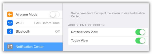
5. A number of our editors are complaining about changes in the Notification Center, but I think you’ll get used to it. I like these changes. It’s actually easier to use and more intuitive — for my right-brain mind, anyway. Everything now pretty much is presented in summary views — i.e. Today Summary, Tomorrow Summary and so on. You can switch it back to your more-familiar Notification Center in a half-arsed way by going into Settings, selecting Notification Center and turn off the Summary Views. It’s tedious, though.

Screenshot image credit: Gina Smith for aNewDomain.net
6. On a happier note, private browsing is easier. No longer do you have to dig into Settings in Safari. One of the best iOS 7 changes is you hit the plus ( + ) button to open a tab, and then you tap private. This will let you close all open tabs or go through them and make them all private. Of course, none of it is private from the NSA, but that’s another story.
7. One of the more-intriguing changes in iOS 7 also applies to music. Apple iOS 7 now includes iTunes Radio, which is cool. But it totally changes the way options look at the bottom of the Music app.
Change it back at Settings, Music. Then tap More. And edit that sucker.
8. Some of the people on the bulletin boards are on the hunt for lost buttons in iOS 7 — Apple will likely retrieve them in an upcoming bug fix update. But what is UP with Reminders? No more tapping on the + to start a new reminder. I guess that would confuse the system, what with private browsing and the NSA and all : ) No, now, you just tap the list. Odds are, you’ll figure this out accidentally.
9. Also, there’s a big difference in how you forcibly close iOS 7 apps. That’s another biggie in the rundown of Apple iOS 7 changes. This, again, is a result of the new multitasking. No more double-pressing Home button and pressing an icon to force-close an app. Now you go to the new multitasking area — a best in itself deserving another story to come. You get there by double-tapping Home. Swipe up on an app to close it. I can live with it.
I thought I was being charitable here, but Craig had to hammer me one last time. He’s the expert, after all, and I’m just an Apple customer with a rotten attitude, apparently. Ha. Craig skyped me:
Closing apps before iOS 7 also required a double-tap of the Home button, then long-press on an icon and then touching the X on the app you wanted to close. Now it’s quicker because you double-tap, then just swipe up any app you want to close. I see this is a big improvement. Yes its a copy of webOS — which I loved. But HP killed Palm’s webOS so I don’t see any harm in taking one of its best features.”
Stealing from the grave, in other words. Now that’s the spirit! I’m all for more webOS UI features in all mobile devices. And it was a crime HP killed webOS.
10. Finally, Cellular Settings has moved to a new location. It is no longer in the General area. Now you find its tab right under Bluetooth. The good news is that now, again thanks to the new multitasking, you get to change cellular use for each and every app.
What do you think of Apple iOS 7? Got tips and tricks? Send them our way at tips@anewdomain.net or directly to Gina at Gina@aNewDomain.net or me at David@anewdomain.net. — Craig@anewdomain.net is taking all Apple fanmail : )
aNewDomain.net is cofounded by David Street, Gina Smith, John C. Dvorak and Jerry Pournelle — plus a team of the best tech and science journalists and IT pros in the world. Email Gina at Gina@anewdomain.net and follow her @ginasmith888 or @realGinaSmith


[…] Apple iOS 7 Changes: Great or Suckage? Debate Rages (anewdomain.net) […]
fwiw, i am sitting right now in the midwest with five parents, all of whom are having enormous amounts of trouble figuring out how to close out apps. I just used this story to enlighten them. Thanks anewdomain