aNewDomain — The Google Play Music All Access service has been my go-to music player for a few years now. I was on the fence, but once it got a music library that rivaled Spotify, I bit the bullet and ordered a paid subscription. It was a great decision, and the ease of listening to new music was incredible, but I always felt the user interface was average at best. Not anymore.
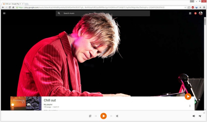
Google has (finally) implemented the material design, which rolled out to mobile devices with Android Lollipop, to the web browser version of Google Play Music. And it looks beautiful.
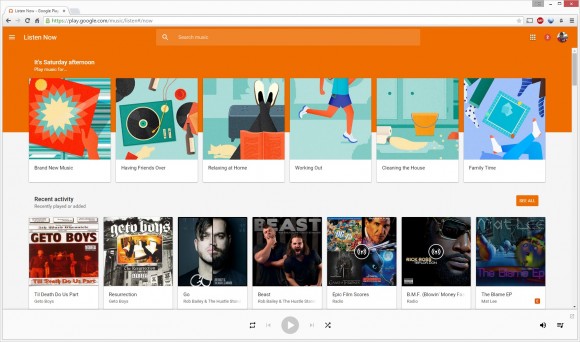
Fluid Interface
At first glance, the main screen of Google Play Music looks fairly similar to its previous update — the one released after Google purchased Songza. Picking up Songza’s algorithm allowed Google to implement automatic playlists that are built upon moods, time of day and other ideals. The last major All Access update saw categories like “Waking Up,” “Working Out” and “Party Time.”
This time around the material design is much more subtle. You have to look in the upper left corner of the screen to notice the iconic menu button of Android — once you click this button you’ll notice the interface is responsive and fluid, just like the Google Play Music app.
There are a ton of new fluid animations that have the gorgeous Google material design. All of your additional options and playlists can be found under the menu button (as before), but now that can be hidden when not in use.
Each button click in the UI is elegant and provides visual feedback, as if they were pressure sensitive. Nice touch, Google.
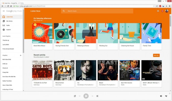
Playback
Having the pretty new interface is one thing, but what about actual playback? I believe that design changes shouldn’t affect performance, but you never know. I fired up a few tracks and found that playback is as consistent as it ever was.
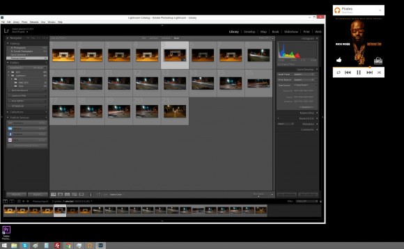
The music queue is available for viewing, though as a pop-up now, and you can see album art for the playing track, which I always love. Sound quality is solid and multi-tasking remains easy, especially with the optional mini player that’s available for use outside of the browser window. This allows you to place the much smaller player on your desktop, out of the way of your work. I enjoy my music while I write aNewDomain commentary or edit photos for my photography sites.
My Grievances
I enjoy the new UI, but my concern still lies with the algorithms used by Google to target personal music preferences. When one clicks on the “Listen Now” section, an area labeled “Recommended for You” is clearly visible. In this section you’re presented with potential artists and albums that Google thinks you will like. Personally, I’d like to spend my music time enjoying several artists instead of one or two.
 Because of this, I tend to select the classic Google randomizer option known as “I’m feeling lucky.” It’s still a great idea (after all these years), but it disappoints when it comes to personal music selection.
From the beginning, this option has done a poor job of recommending new music for me. The button clearly reads “Based on your music taste.” If Google knows my music taste, then one can assume it knows the artists and tracks I’ve already listened to. As you can see below, half of my “randomized” playlist contains tracks I’ve listened to previously, which is way too high of a number.
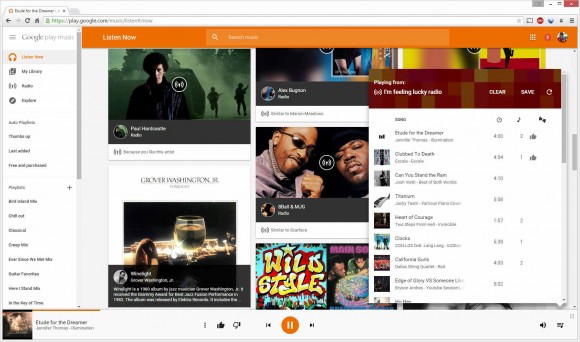
This is an everyday occurrence. Initially, I was lead to believe the Google All Access music library was small because they never included a ton of new music. I don’t feel that way anymore — I can use the search box to pull up the most obscure and random artist or song in my mind without an issue. So why does the randomizer give me so many songs I already know?
I am a firm believer in feeding Google data to make my day-to-day life more convenient. I’ll make the effort to click the thumbs-up icon on the music I enjoy, believing that it sends a signal to Google regarding my preference in music. This works great in YouTube (a Google property), but not in All Access. C’mon, Google! Please stop recommending that I listen to songs by Drake!
All in all, I will continue to use Google Play Music All Access. It’s the music streaming option that fits my needs best, especially since I’m wrapped in the Android ecosystem (proud owner of multiple Android devices, a Google TV and a Chromecast). I’m glad the UI got a material makeover, but I’ll feel even better when the engineers of Google get a better grip on my music preferences.
For aNewDomain, I’m Ant Pruitt.
All screenshots: Ant Pruitt



I have the same problem with Google Play Music: the recommendation feature just isn’t that great most of the time. Also, once you start a radio, giving tracks the thumbs down doesn’t adjust that playlist. You have to manually refresh to get a new list of songs.
Glad it’s not just me. Thanks for reading and your comment, Mr. Head!
-RAP, II