aNewDomain — I run a group, and belong to the same group, of photographers called the Smartphone Photographers Community. We’re all about sharing smartphone photography tips and tools. And one of our favorite tools is the mobile photography app called Snapseed. The app just received a major update and overhaul.
We figured it was going to be good. It turned out to be not all that.
So, this previously powerful, semi-granular mobile photography editor has now upgraded to … a slightly more powerful and semi-granular mobile photography editor.
There are a few more options baked into this app, but the problem doesn’t lie there. It’s in the interface. Nik Software has made a big mistake in this respect.
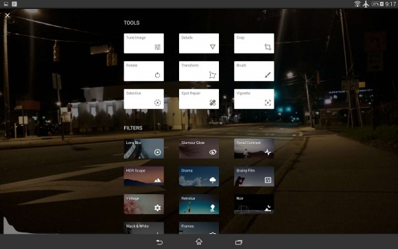
Check out the screenshot below. As you can see, the Snapseed upgrade presents you with a ton of options, instead of just your standard cropping and filter choices. But these menus cover your canvas in the interim. That’s a problem.

The Cons
Having these menus along the sidebar or bottom is perfect for intuitive swiping, and that’s how the app used to function. This would allow you to focus on your photograph and see changes on the fly. For example, selecting filters in the previous version allowed you to see how your images were affected real time.
If you didn’t like it, you could swipe to the next filter and watch the change occur.
But with the new version you choose a filter, then watch the image load, then decide you don’t like it, then tap the “+” to see the menus — menus that cover your image completely and change the way it’s lit. Then you select a new option.
You lose valuable seconds trying to compare different filters due to the clumsy UI, which is a major drag.
The Pros
The Snapseed upgrade has more great tools, such as Transform, Lens Bur and Brushes. The Transform feature is usually found in powerful desktop photography editors like Lightroom and allows you to elegantly bend and tilt image perspectives. Sometimes an object should be rotated slightly to the left in an image. This is difficult in most mobile editors as they only allow x-axis rotation. The transform option allows y-axis rotation, which is extremely handy.
Like Photoshop and GIMP, masking is now available in Snapseed. This allows you to isolate sections of an image for detailed editing. It can come in handy when trying to clean up artifacts in an image, such as the sky’s blue haze.
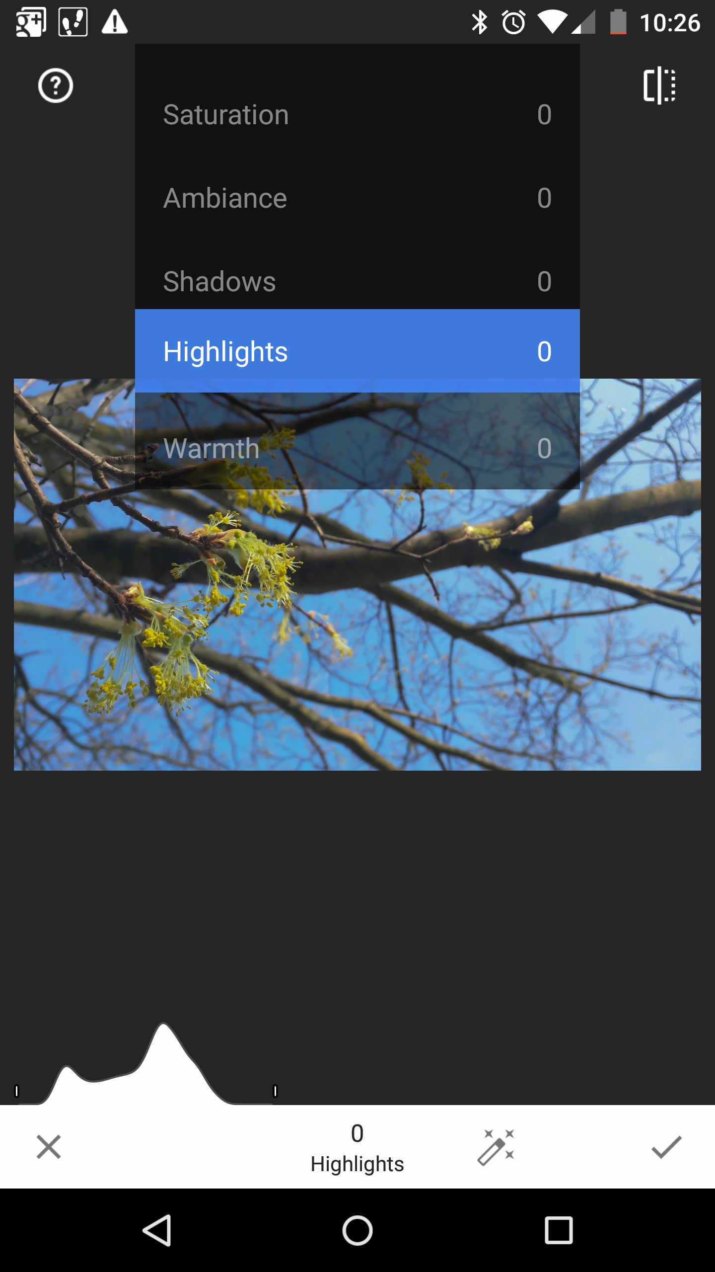
Once you’re passed the clumsy menu, fine tuning remains true to the original app, with a couple additions. When working in brightness and contrast there’s a new “Highlights” option, which I love. It’s really useful when trying to adjust tiny bright spots of a photo that can sometimes be distracting, such as lights in a high-rise building. Those lights are cool to see in the photo, but sometimes overpower the shot, which may hide the interesting building structure.

Verdict
Snapseed is still a mobile photography editing app worth having on your smartphone or tablet. The interface will take some time to get used to if you’re from the old regime, but you’ll manage. I mean, it couldn’t be as bad as going from Windows 7 to Windows 8 (low blow, I know).
Overall the new Snapseed upgrade is worth giving a shot. Find the app for Android at GooglePlay or for Apple iOS at iTunes.
For aNewDomain, I’m Ant Pruitt.
All images: Ant Pruitt


