

aNewDomain.net — Is your website failing? It is if it isn’t building or expanding your business. Here’s how to fix your website. All you have to do is avoid five simple mistakes so many site builders make. Then you’re home free.
Mistake No. 1: Your site design is too complicated.
You don’t need to use every trick in the web designer’s toolkit. In fact, making a site too complicated is the No. 1 reason sites look strange and are difficult to navigate. You want harmony. Elegance. Don’t risk losing a view, a lead or a sale just because you or your designer got all fancy. Make sure it’s obvious where visitors to click to get various functions done, and prioritize those functions accordingly.
The fix: Simplify. The greatest, most elegant design is always the simplest one.

Image credit: ZocDoc
Digging deeper, think about the single most important thing you want people to do when on your page. Share? Buy? Read? Get a message? Design the site around that single point of focus. And minimize competing elements while you’re at it.
Here’s an easy exercise: Squint your eyes and look at the site to see what leaps out at you. Those are its focal points are. Make sure every page on your site has a clear call to action in every case and on every screen, so visitors always know what to do next. That will maximize the time they spend on your site and minimize the time they spend on a competitor’s site.
Case Study: ZocDoc’s search form is the central focus of the page. Check out the screenshot above. The site makes it abundantly clear what a visitor needs to do.
Mistake No. 2: Your site confuses your brand with a faceless corporation.
Small business websites make this mistake often. In an effort to sound more professional, they use overtly formal language and too much generic, glossy-looking imagery. You don’t want to turn your brand into something that looks like it came out of a retro IBM shell. People do business with people — not stuffed shirts. And definitely not with robots.

Image credit: PrimeSupport
The fix: Show your face on the homepage. Show the real humans that make your site and business tick. Eye tracking studies show that people are drawn to human faces. And, not surprisingly, split tests often show better conversion rates for sites featuring smiling faces.
Case Study: New Jersey IT firm PrimeSupport features a team photo that immediately makes you get the idea behind their personalized service. These are real people here. Not models out of some stock art catalog.
Mistake No. 3: Your site is too generic.
Forget the industry standard. Stand out from the pack. Don’t be afraid to show your signature style — one that’s unique to what your competitors show — and you won’t risk losing business to those competitors. Show your look and feel. And if you don’t have one, get one.
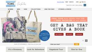
Image credit: Toms
The fix: If you’re struggling to figure out what best separates your business from the pack it’s in, think about what unique offering your brand or company offers. What’s your Zag? Do you have the fastest delivery times? Highest-rated customer service? Best warranty? Your website should emphasize what you do differently.
Case Study: TOMS stands out by combining sales with philanthropy: For every shoe a customer purchases, the firm donates a pair to a child in need. And the site has a unique way of delivering that message, too. It has its own voice. Find yours.
Mistake No. 4: Your site doesn’t connect with your customers.
Some sites spend twice as much time talking about their own business then they do actually addressing their customers. Odds are, your site’s visitors could care less about the awards you’ve won and the sparkly team resumes. They only visit your site — any site — in order to improve their lives in some way — socially, economically, professionally, what have you.
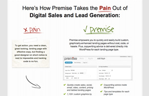
Image credit: Premise
The fix: Figure out what problems you solve for your customers. Then make sure your site communicates the benefits your products or services bring to the table.
Case Study: Premise explains exactly how it’ll take away customers’ pain.
Mistake No. 5: Your Site Makes Crazy or Incredible Claims
You’re smart. Your customers are just as smart. Over the top pitches and wild offers just discredit the business. And no one likes being aggressively lied to. You need to communicate why visitors should trust your brand or business. And that’s easier than it sounds.

Image credit: I Will Teach You to be Rich
The fix: Think about what would convince you if you were an outsider looking in. Show video that proves your claims. Testimonials. Before and after photos. Real people — real customers — should sing your praises. You shouldn’t sing them yourself.
Case Study: Ramit Sethi’s I Will Teach You to Be Rich uses press logos, sample downloads and customer testimonials to back up his bold claims.
Avoiding these common mistakes — even if you do it just one at a time — will be the fastest way to fix your website.
For aNewDomain.net, I’m Sarah Peters.


[…] How To Fix Your Website: Avoid These Five Mistakes by Eric Searlesman […]