aNewDomain.net — Data mining isn’t just for the U.S. FBI and NSA. Who said it was? It has long been cutting edge tech for business publishers — but on the money side. Now we’re at the forefront of seeing investigative journalists using data mining to break and enhance their stories. Startup Exaro News is betting journalists will love the data and be willing to subscribe to it, too. Here’s more on data mining journalism from our David Michaelis.
And here’s a video on whether data journalists are the new punks — via TedX Pantheon Sorbonne. Scroll below the fold for a case study and more on how this works.
Video credit — TedX Pantheon Sorbonne: Simon Rogers, Are Data Journalists the New Punk?
It’s not just for the FBI and CIA anymore. We’re talking data mining.
Until now non-profit investigative outfits were the primary users of data mining. But now in the UK a new service is trying to monetize this option. Investigative journalism startup Exaro News is launching a subscription service offering access to structured insolvency data soon. It hopes corporate customers and big media will subscribe to this service.
The publicly available data — currently published in the London Gazette, Edinburgh Gazette and Belfast Gazette — are gathered by Exaro journalists who are always looking for a steady source of investigative stories. Check outo this already-launched series
Exaro is now planning to re-purpose the data it sells to individuals and firms. These sorts of data services are nothing new.
Why should business customers prefer to pay a load of journos?
Exaro editor Mark Watts believes that data investigative journalism is the future — following the money trail, as the saying went, was a journalistic tool of legions of investigative journalists in the past, after all. So you’ve got stories centered on facts — as opposed to witch hunts.
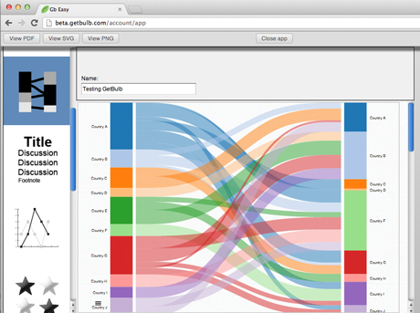
The new data visualization tool GetBulb is now being used by a small group of users. The first 100 invitations are out and the Irish startup is currently gathering feedback with a planned launch at the end of July.
Working in a web browser — for now, Chrome only — users select the type of visualization they want to create, drag and drop the template into the work area and then copy data from Excel and paste it on top of the graph or map.
A range of different visualizations are available to choose from and GetBulb converts the data instantly.

Users can create a series of visualizations with text in-between graphs and maps and can save them as a PDF, SVG and PNG.
The app is currently free to use with GetBulb planning to monetize by charging occasional users a fee to turn a visualization into a PDF or other file type. Regular users will be offered subscription packages.
In a blog post announcing the release of the first invites, Oliver Mooney, chief executive and founder of GetBulb, said this is an early version and new elements will be added as the first users provide feedback.
In the meantime, the non-profit www.publicintegrity.org cracked the code for cheating at Medicare.
Or check out Internews coverage of Kenya through its Data Dredger.
Video: InternewsKE
Internews, which supports independent media, has branched into the following:
- Visualizing Iraq’s Oil Industry: In Iraq, a new interactive map for the first time shows all the elements of the country’s oil infrastructure, such as oil pipelines, refineries and oil wells.
- InfoAmazonia: In Brazil, a comprehensive online map makes extensive use of data to continually track the deteriorating environment of the nine-country Amazon region. The map—a mash-up of existing technologies such as satellite images, open data and media and social-media feeds—is hosted by O Eco, an environmental news site, and supported by Internews’ Earth Journalism Network.
The BBC has long experimented with format and presentation. Journalists and editors are able to build short stories and use the tool to assist investigative reporting . Such so-called data-driven stories give you an authoritative new perspective in an innovative design. Here’s an example from the BBC.
-
Great British class calculator
-
Name of the organisation: BBC Visual Journalism
-
Country: UK
-
Category: Data-driven applications –mobile or web — big media
-

-
The BBC wanted to explore the modern British class system, as traditional social divisions of upper, middle and working class no longer reflect current occupations or lifestyles. To do this, the BBC teamed up with sociologists from leading universities. More than 161,000 people took part in an online survey, the largest study of class in the UK. It measured economic capital – income, savings, house value; social capital – the number and status of people someone knows; and cultural capital – the extent and nature of cultural interests and activities.
-
The sociologists analysed the data and came up with seven new class groups ranging from the wealthy, highbrow Elite to the deprived “Precarious proletariat”, via New affluent workers and Technical middle class. The calculator is a fun way to engage users in the data by finding out which of the new groups they belong in.
-
The data came from the BBC’s own online survey tool, BBC Lab UK, which was supplemented by a separate study, run by the academics involved. This was to access hard-to-reach groups and to balance the self-selective nature of the BBC survey. The data was compiled and analysed by a team led by Mike Savage from the London School of Economics and Fiona Devine of the University of Manchester. The BBC then used this to create a calculator. BBC Lab UK is the BBC’s re-usable interactive survey platform. It is a ‘signed-in’ service and captures data securely, anonymously and stores all test data encrypted on a common database. Each test is designed by top academics in their field to answer specific questions from their discipline. Each participant will find out something new about themselves by taking part, but when all participant data is put together, highly significant findings can result from the researcher’s analysis.
-
The calculator used the Raphael JS library to create vector graphics which altered depending on what the user selected. The selection referred back to the dataset to give the user an outcome. We developed it to work across platforms and were rewarded with high mobile and tablet traffic as well as desktop.
Based in Australia, David Michaelis is a world-renowned international journalist and founder of Link Tv. At aNewDomain.net, he covers the global beat, focusing on politics and other international topics of note for our readers in a variety of forums. Email him at DavidMc@aNewDomain.net.


