 aNewDomain — It’s springtime and sports fans still can’t get their minds off the NFL. The league’s brand is that strong.
And it’s understandable. Football is our national pastime. Despite its many issues, the NFL is riding a wave of popularity unmatched in all of pro sports.
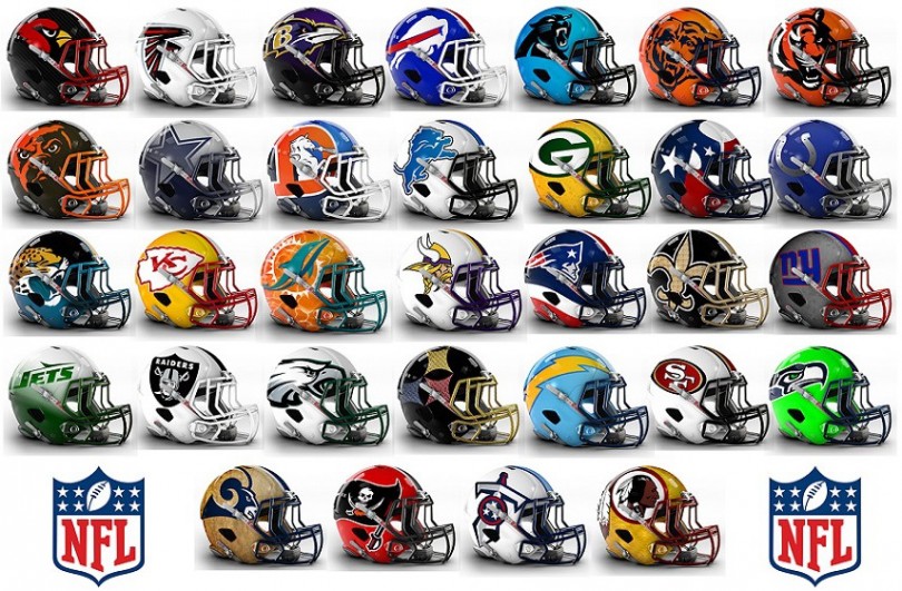
That must be why some designers are spending the offseason tinkering with team helmets, trying to build a better brand. Here, we take a look at Deeyung Entertainment’s helmet redesign recommendations, ranked from worst effort to best.
- Tennessee Titans: Ugh. A terrible team with a terrible logo. Not much to work with here.
-
Cleveland Browns: Yes, the Browns need to do something about their look. This isn’t it.
 30. Pittsburgh Steelers: Here’s an example of an iconic look gone wrong. No need to mess with a good thing and this helmet does just that. Mistake.
- New York Giants: Another example of a team that doesn’t need to switch things around. The current helmet, which pairs well with the team’s uniforms, works just fine.
-
New England Patriots: I’m not fan of the Patriots’ logo or their helmets. This takes a bad look and makes it even worse. Congratulations.
-
Oakland Raiders: Dropping black as the dominant color takes away much of the Raiders’ mystique.
-
Baltimore Ravens: The only change here is in making the Raven head larger. That’s not enough of a switch to make a difference.
-
Carolina Panthers: The Panthers’ color scheme is pretty bad. Black and sky blue just don’t mesh. This helmet proves that.
-
Jacksonville Jaguars: Sticking the Jaguars with a two-tone look isn’t a good idea, but at least this idea ditches the gold the team presently wears.
-
Seattle Seahawks: Seattle was the only franchise that took advantage of the league’s switch to Nike uniforms to make its own change in 2012. This proposal goes too far in emphasizing the Seahawks’ neon leanings.
-
New York Jets: Just as he did with the Patriots, former coach Bill Parcells switched the Jets look in 1998. This time, he got it right. This updated look isn’t an improvement. At least it isn’t a Butt Fumble.
-
St. Louis Rams: I’ve always been a fan of the Rams’ horn logo, especially when the team went to navy blue and gold before the 2000 season. Not really nuts about this new look.
-
Dallas Cowboys: Not much changing here. This change follows a common theme: color scheme remains the same, logo gets bigger.
-
Green Bay Packers: Much like the Cowboys, this look isn’t much different from the Packers’ traditional helmet.
-
Chicago Bears: Interesting thought to introduce an actual bear into the logo instead of the trademark “C.”
-
Houston Texans: I like the Texans’ current helmet. This one takes it too far.
-
New Orleans Saints: New Orleans’ old gold and black turns reverse and the logo gets bigger. I’ll always prefer gold as the background color, so this doesn’t work.
-
Philadelphia Eagles: A bit of an improvement. Never been a big fan of black and green together, so the white background takes it down a notch.
-
Detroit Lions: Changing the silver background to white is a good start.
-
Denver Broncos: Another ode to logos past, this is a twist on a Broncos tradition with a magnified “D” and horse.
-
Atlanta Falcons: Going white is also a good direction for the Falcons, although I would have preferred a red helmet. Either way is nice.
-
Washington Redskins: Here’s another retro look, back to the 1970 and ’71 seasons. It’s time for the Redskins to change a lot of things.
-
Arizona Cardinals: Almost anything would be an improvement over the present Cardinals’ helmet. Introducing a black background is a positive change.
-
Miami Dolphins: Dolphins fans almost lost it when the team changed its logo before the 2013 season. They would come unglued with this helmet and its orange background. Love it.
-
San Francisco 49ers: These helmets would be near-perfection if it weren’t for the fact that the Niners’ helmets are already the best in the league. I love the white background but it’s tough to improve on a “10.”
-
Minnesota Vikings: Another team with a good enough helmet as it is. I like the white background (again) and Viking logo.
-
Cincinnati Bengals: It’s time for the Bengals to make a change. Their current tiger-stripe logo has been intact since 1979. This switch may not be perfect, but it’s a good start.
-
Tampa Bay Buccaneers: Gone are the days of Bucco Bruce and those hideous pastel orange uniforms. The pirate flag is a great logo and I hope it stays a long time.
-
San Diego Chargers: An interesting update of the classic baby blue Chargers look. These helmets would look great with white jerseys.
-
Buffalo Bills: Buffalo has tinkered a bit with its helmets the past few years. This iteration would be a good step forward.
-
Kansas City Chiefs: This was a tough choice for the top spot. Going to a gold background would freshen the team’s helmets and bring new and interesting possibilities to their uniforms.
-
Indianapolis Colts: Now this is what needs to be done when a team changes it helmets. Going from the bland logo that has existed since the Johnny Unitas days to a more-modern look would be a huge improvement.
For aNewDomain, I’m Rodney Campbell.


WRT the Washington, DC professional Football Team, I like the design. Sadly, it’s racially offensive to many people. I hope you were referring to a name change when you alluded to alot of things needing to be changed. I’m a bit disappointed you didn’t just come out and say it. I would request that in the future, you refer to them as the “Washington, DC Professional Football Team”. I know it’s a lot to write down, but please, do the right thing.