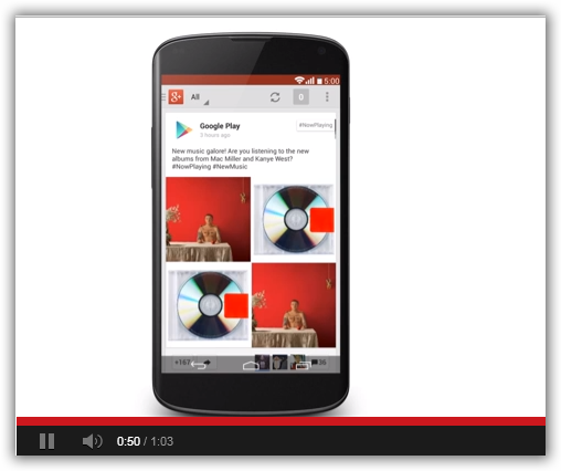
aNewDomain.net — As baseball great Yogi Berra once quipped, the hardest thing to predict is the future. True enough, but check out this Android 5.0 concept video. The video, created by Google user Craig Tuttle, sure gives the Android fans among us a lot to chew on. I think it’s masterful. A girl can dream. What do you think? Check out Craig’s idea of what the October 2013 release of Android 5.0 should and might look like. It’s the Android 5.0 Concept video, below.
Video: Craig Tuttle YouTube channel
Here’s what Craig says he based his Android 5.0 concept video on, in his own words:
Creative concept videos have always brought me a sense of wonder and dreaming of what the next iteration of (future) operating system software might be like. About four months ago I decided to make it a personal goal to make a video mock up of a piece of software — and the timing (is )just about perfect to get in an Android 5.0 concept video before its release in October.
Google however decided to throw out a surprise in Kit Kat 4.4. So instead of switching all of the numbers throughout the video I just decided to leave it as 5.0.
When I sat down to figure out where Android had a chance of heading, I started by asking the question: ‘Where does Google and the Android team seem excited to move?’ Through this question the answer seemed obvious — information magically delivered without the user even having to ask for it. Google Now is (Google’s) giant leap into this area of predictive search, so why not combine the rest of Android with Google Now?
Most of us live our lives through our phones, so why not utilize that data. When a new text comes in, Android analyzes it and brings up relevant information. A friend asks if you want to see The Hobbit at 7pm and Android automatically adds this time to your calendar if you reply yes. Its these tiny optimizations that would make an OS and life so much simpler.
I tried to pull from the design cues that the Android team has dropped into its own apps over the course of the summer. You’ll notice that much of the UI has transitioned from the darker holo to the lighter holo coloring.”
Gina Smith is the New York Times best-selling author of Apple co-founder Steve Wozniak’s memoir, ” iWOZ: How I Invented the Personal Computer and Had Fun Doing It”. (W.W. Norton, 2005/2007/2012). With John C. Dvorak and Jerry Pournelle, she is editorial director at aNewDomain.net. Email her at gina@aNewDomain.net, check out her Google + stream here or follow her @ginasmith888.


Awesome!
seems reasonable as a guess.
-RAP, II