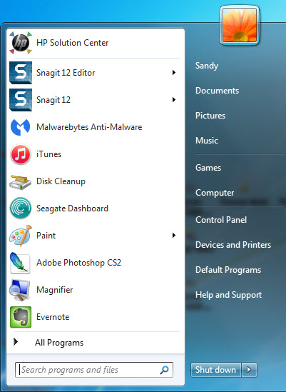
 aNewDomain — Windows 10 is coming, and there are a host of features that Microsoft has implemented to put its OS back on top. The most noticeable feature? The Start Menu. That’s right, it’s been resurrected and updated to shine in Windows 10. The new Windows 10 Start menu boasts a combination of the old, lovable and widely recognized Windows 7 Start menu (on the right), and the full screen colorful tiles from Windows 8.
I was surprised to see that this dual approach works quite well. To give you an idea of what the Windows 10 Start menu will look like, take a look at the default Start menu from Windows 10 Insider Preview build 10122 below.
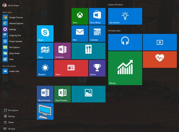
The new Start menu blends a Windows 7-style Programs list on the left with a display of Windows 8-like tiles on the right. The list on the left starts with Most used and Recently added. At the bottom are links to File Explorer, Settings and a link to All Apps. Thankfully it also contains a link to the Power options. And, of course, you can see the tile-design of Windows 8 to the right of the list.
Customization is Key
The beauty of the Windows 10 Start menu is that it can be resized at will, and the colorful tiles can be dragged to any position. They can also be grouped and each group can be given a name of your choosing. If you compare the default view above with the customized view below, you’ll see that I’ve moved tiles around, formed new groups and opened the All apps link.
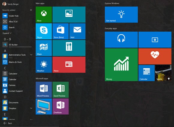
When All Apps is open in the current Insider Preview, every single app is alphabetically arranged in a difficult-to-manage, scrolling list with letters for group heads and icons to break up the space. This is my only complaint of the Windows 10 Start menu.
The cascading menus in Windows 7 were much more useable. I believe that even an alphabetized list without the letter headers would be better, but leaked screen shots of the next Windows 10 build show the apps menu may, instead, be even more reliant on the idea of choosing apps by their first letter. It’s unclear how this will end up, but it could make navigation difficult.
One extremely nice feature is that the new Start menu can be customized. In the Settings area there’s a Personalization option, shown below, that will make the setup and navigation of the Start menu more useful. The Insider Preview version doesn’t have all the options available, but the final version will.
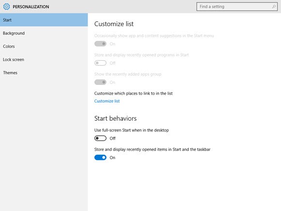
This area gives you the option to customize your Start list to include things like Documents, Downloads, Music, Pictures, HomeGroup and more. You’ll also have an option to see the Start menu full screen when in the desktop mode, as shown below. This view makes the background of the Start menu translucent, allowing the Desktop background to show through. It’s a nice touch, and will feel familiar to Windows 7 users.
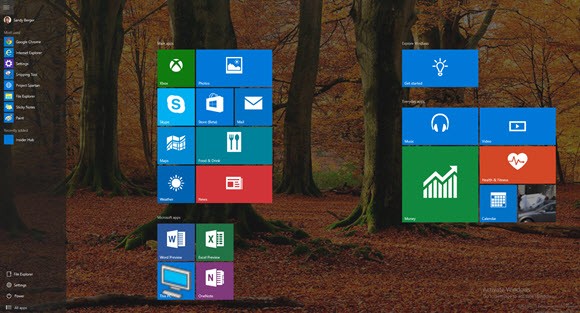
All-in-all, the Start menu that was completely AWOL in Windows 8 will make a triumphant return in Windows 10. I can’t wait.
For aNewDomain, I’m Sandy Berger.
Image credits: Sandy Berger

