aNewDomain — I’ve had smartphone fatigue for quite some time. Don’t get me wrong, I enjoy getting the latest and greatest smartphone, but today most smartphones look the same and offer almost identical hardware specs. Large quad-HD screens, fast processors, tons of RAM … big whoop.
What sets one mobile phone apart from another when all the specs are the same? The user experience and software. Nextbit looks to give you a great experience that differentiates it from traditional smartphone design.
Nextbit has taken mobile phone design and turned it on its head. Smartphones, by today’s standards, are all candy-bar shaped and colored white, black or some shade of grey. The Nextbit smartphones are (switching to my Jony Ive voice) slender with “beautifully curved lines displaying masterful design.” All that design supposedly gives consumers a comfortable handgrip while texting and making calls.
Nextbit’s Chief Product and Design Officer Scott Croyle has broken the mold with its Robin smartphone. I got a chance to check out the Robin at Big Android BBQ 2015, and I’m more than impressed. My thoughts below.

Nextbit Robin Goes for Storage
The Robin is a mid-range smartphone designed first and foremost to help manage your storage. We all take tons of photos and videos on our smartphones. Almost none of us think to delete the old, crappy photos and videos. This chews up your phone’s storage capacity rather quickly. And there’s always the app “flavor of the month” that tends to sit on your home screen forever — even though you’ve only used it once.
The Robin software package regularly scans your device and takes inventory of what apps you’ve installed. Next, it looks at the usage history of apps and photos. If you haven’t used the apps recently, it backs up the data to the Robin cloud connection and snoozes the app. Essentially, the app isn’t uninstalled, but the processes and data is offloaded.
This gives your device better performance and more storage. How much storage? The phone is shipping with either 16GB, 64GB or 128GB 32GB of on-board storage, and 100GB of cloud storage.
Robin Design
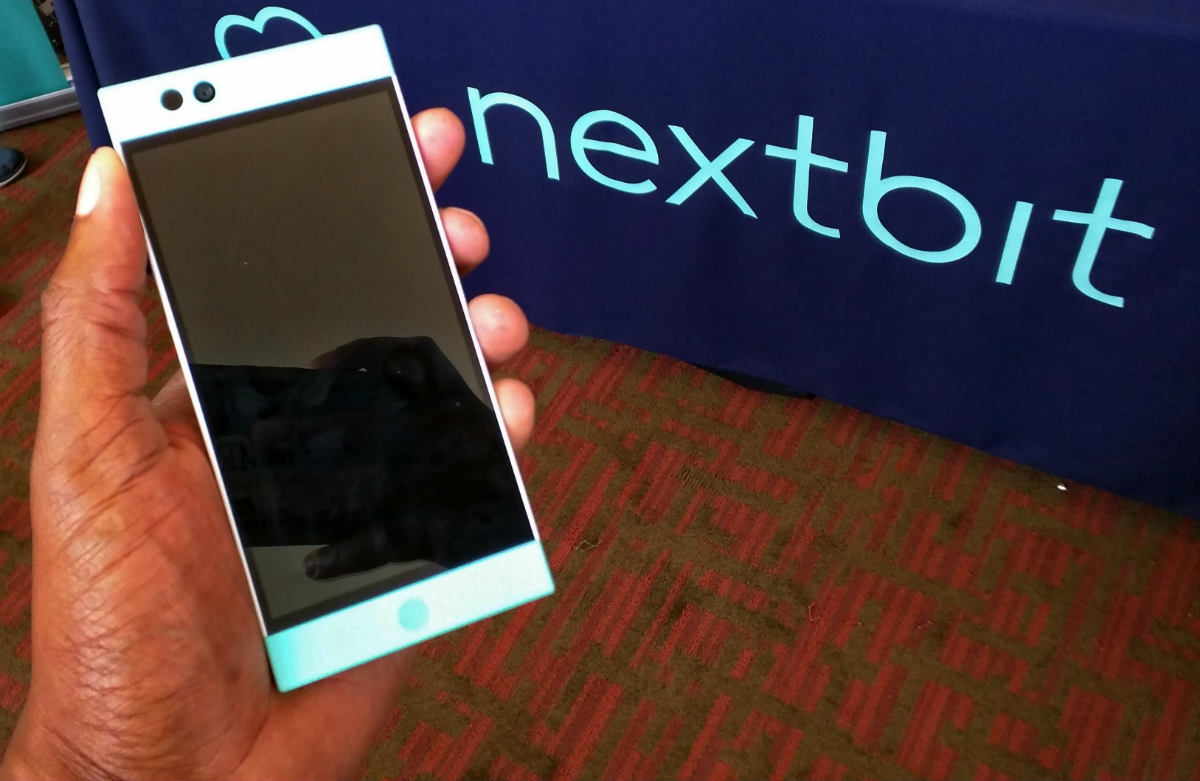
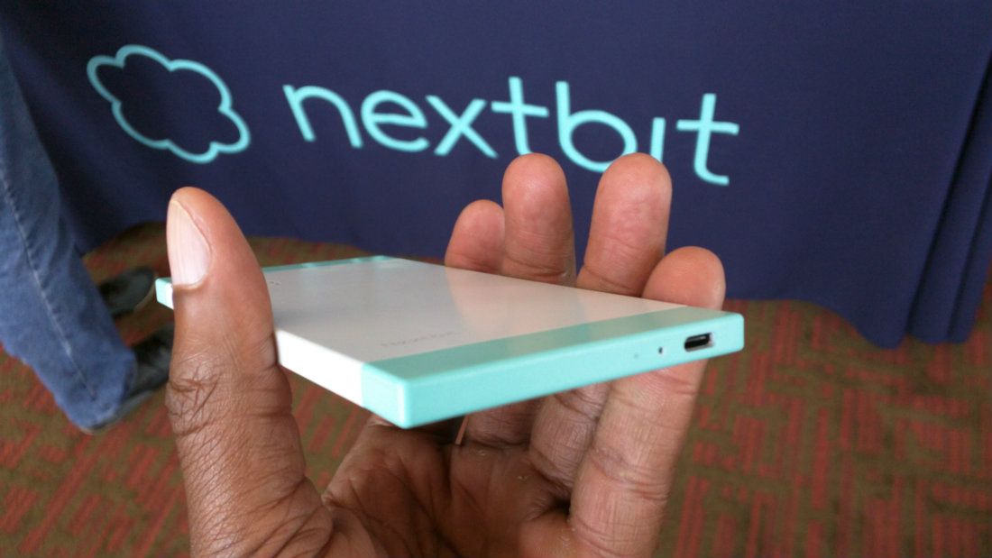
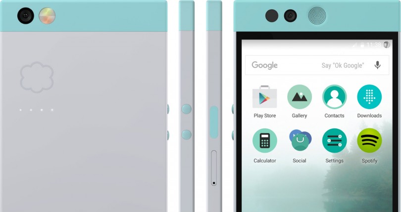
When looking at the Nextbit Robin, it becomes clear that it’s not your typical smartphone design. Yes, it’s still a rectangular shape with buttons. But it’s got squared edges (instead of rounded) and bright pastel coloring.
It’s well documented that Product and Design Officer Croyle knows his way around a design canvas — he was previously Senior Vice President of Design and UX at HTC. The HTC phones have been wildly popular, touting sleek designs and unique features.
When I held the Robin phone, the thickness and weight felt just right. The squared edges were more comfortable than I expected. The buttons are placed properly for your fingers, which makes them easily accessible and very pushable.

I got the inside scoop on the button design: The current placement is the result of placing several different types of buttons on the side of the device during unit testing. All the test buttons varied in texture, size and placement. This forced engineers to be natural with the phone each day and pinpoint exactly what type of button should be used. Even the texture of the buttons was carefully considered.
Robin Tech Specs
From a spec standpoint, the Robin is modest compared to the other leading smartphones. But it has the Snapdragon 808 processor and 3GB of RAM, so it shouldn’t be considered weak by any means.
I spoke to Harold De Armas at the Big Android BBQ, and he explained that the mid-range specs of the Robin are to keep the costs down. This will allow more consumers to purchase the phone. And just because it has mid-range specs, this doesn’t mean the phone will perform poorly. The Nextbit software overlay of Android is super efficient — the phone ran buttery smooth during my brief time with it.
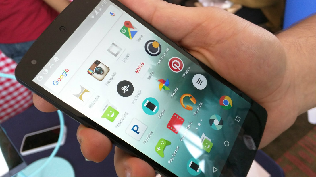
I will say that the software overlay did remind me of iOS, as it currently doesn’t have an app drawer or widgets. Just a few screens of apps. De Armas explained that launchers will soon be available through third-party support.

I really dig what the team at Nextbit is doing for the smartphone market. There are so many unhappy consumers when it comes to phone storage. Devices continually get clogged with bloatware from mobile carriers, which sits on top of an OS that typically takes up at least one third of your typical 16GB of storage. Apps are also getting more sophisticated and tend to require more storage, leaving you with minimal free space on your device for photos or other data.
The secure connection to the Nextbit cloud offers a great answer to storage wars. Coming in at the competitive price of $399, the Robin allows consumers to pay for an unlocked device at roughly half the price of an unlocked Apple iPhone or Samung Galaxy.
Good on ya, Nextbit. Keep smartphones interesting, and continue to set yourself apart from other OEMs. Not only have you kept things moving forward in hardware and design, but you’re standing out in software. I can’t wait for the Robin to launch.
Here’s the video for the Nextbit Robin.
Video: Introducing Robin
For aNewDomain, I’m Ant Pruitt.
Featured image: Screenshot courtesy Nextbit
Body images: Ant Pruitt


