anewdomain.net — As the tech world prepared for Google I/O 2013, Vic Gundotra and the Google Plus team announced a new and improved G+ UI with major changes in three areas: stream, hangouts and photos.
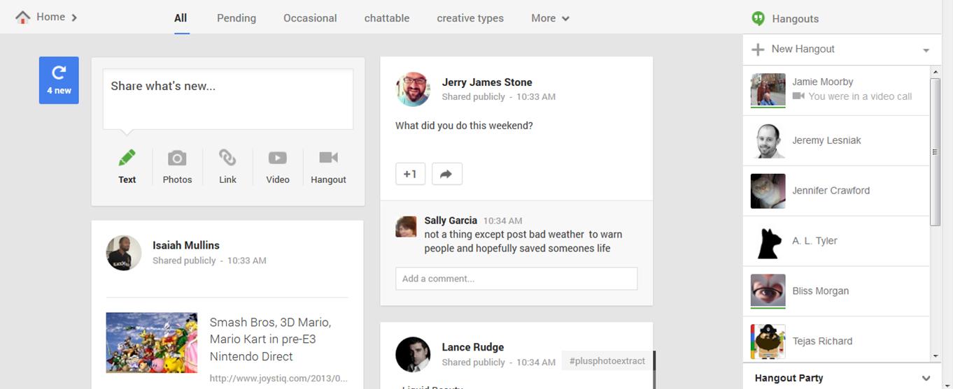
The stream changes are both clever and visually appealing. The design flows more easily between different devices and adds a multicolumn layout. Users can scroll down to view their stream and not worry about the stream jumping while reading an article.
Ready to see the newest posts? Click the small blue counter in the upper left and the stream will refresh with the most recent posts from people in your circles. Other new features to the stream include suggested hashtags based on the content of your post, and animations to the sharebox, menus and cards.
The new Hangout app combines text, photos and live video across multiple platforms — Android, Apple iOS and your computer. Added features include conversation history, less annoying notifications (once you see a notification on one device, it will be wiped from your other devices), easier video calls and more accessibility from different devices.
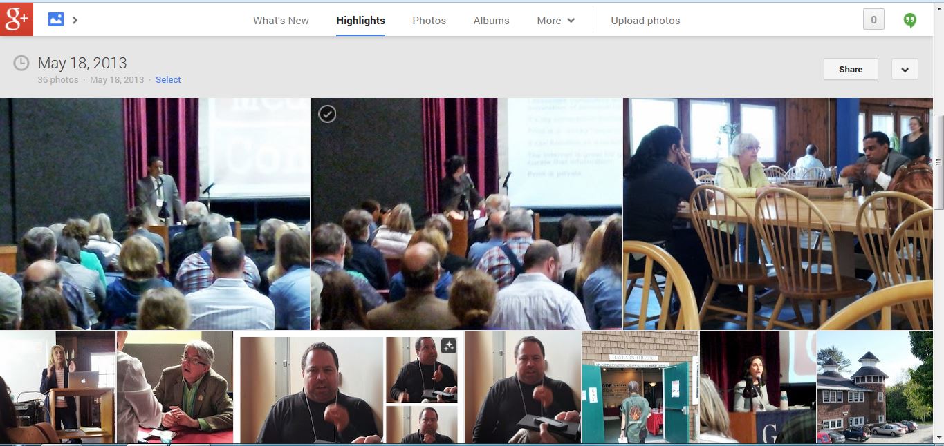
Boasting auto back up, auto highlight, auto enhance and auto awesome, the Photos updates turn your image center into your personal dark room. Backup allows for automatic backup of photos from your mobile phone to G+, with user permission. Auto Highlight prioritizes higher quality photos in your library and de-emphasizes duplicates with poor image quality or exposure. Auto Enhance allows users to improve their photos automatically. After uploading your photos, Google will provide some suggested enhancements to improve the brightness, contrast, focus and dozens of others. Auto Awesome is the most intriguing new Photo feature. If you upload a series of sequential photos, Google will try to animate them into your own fancy GIF. If you upload several family photos, Google will look for the best smiles and combine them together to create the perfect shot.
Some updates are a little less awesome. The double scroll bars in the notifications window are awkward, and maximizing images in the stream at the expense of text seems like a strange call for a service highlighting interactions and engagement.
Overall, the benefits of the new update far outweigh the challenges, providing a more user-friendly and visually appealing G+ experience.


