


aNewDomain.net — There is no shortage of Apple news. The release of iOS 7, the new iPhones and the seemingly endless debate over mobile technology and its uses has saturated the tech news cycle pretty seriously.
We can debate hard-and-software specs, benchmark performances, and the Nexus 5 hopes and dreams in a variety of semi-interesting and important ways. These devices, after all, guide our daily lives with grace. They grant us reprieve from a world that could not remember our wants and desires, our deadlines and fridge contents.
However, I want to look at the larger implications of the new Apple. This is, after all, the first major launch since Job’s passing. What does Apple want, what does its new world look like, and what does it change?
Design
Let’s all say it together. Skeumorphic. To mirror the textured, tangible world.
Apple’s flagship concept was the visual bedrock of iOS for six years. This graphical standard worked for two reasons:
- It separated Apple from the competition. Even as mobile tech grew to compete heartily with iOS, the look of Apple’s software has been a distinctive trait, one that consumers know instantly.
- It cemented the bridge between the real world and the new-fangled-world of technology.
Infants and geriatrics (and innumerable citizens in between) are partial to iOS because it is simpler — less customization, less features, no rooting necessary — but there is more to it than that.
Apple pioneered the smartphone technology that looked like the physical world. It seems simple, but for the population that does not instantly understand how technology works, this was the answer.
Now, however, the bedrock has been mined and shipped out to distant seas. iOS 7, as reviews across the board tote, is ultra-clean. Thin lines, white backgrounds, clear shapes. iOS 7 looks like a space-candy-toy that left its earthly younger brother back on the home-world.
Where does that leave those who walked Apple’s bridge and now have email accounts, Facebook statuses and a digital collection of music? It is too soon to tell, but Apple is relying on the idea that those who needed to get on board did, and everyone else will just understand.
If we are all honest with ourselves the new iOS looks like its competition. It is shinier, childlike and more polished than Android or Windows 8, but when put side-by-side the lines begin to blur.
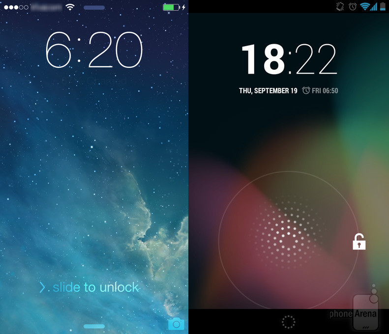

Image Credit: PhoneArena.com and WindowsPhone.com, Respectively
This video does an excellent analysis of just how similar Android 4.3 and iOS 7 are now.
The big question is why — why did Apple create an OS whose appearance so closely resembles its competition and why did it move away from textured design?
Ideology
Apple has always been preoccupied with ideology. Steve Jobs famously said (over and over, it seems) that “people don’t know what they want until you show it to them.” Focus groups were not the company’s strong point, sure, but after Apple “showed” us what we wanted, it always did an elaborate job of telling us just why we wanted it.
Those historic explanations continue to this very day. Check out the promo video for iOS 7, brought to us by SVP of Design Jonny Ive.
If you overlook the immense amount of pretension displayed (sorry, Jonny), the answer to “why” becomes clear.
Ive claims the company’s vision is to make iOS inconspicuous. He says, “In many ways, we have tried to create an interface that is unobtrusive and deferential. One where the design recedes, and in doing so, elevates your content.”
These changes are bent on increasing content, productivity, and above all, functionality.
When looked through a realistic lens, though, this is strange. An interface where the “design recedes” is the exact opposite of iOS 6 and before. That entire concept was design. That was the whole point.
That has been Apple’s whole point for a decade now. Design can recede without disappearing, but this is a serious leap that has been overlooked by many. And it’s all for increased functionality and content, both of which are brought to you by someone other than Apple.
But, the second and more important part of that video, is the confident ideology that Ive imparts.
Apple has always had a way with words. The company is intellectual and superior in the way it carries itself — traits taken from the late Jobs. It has always played the underdog to some larger, exhaustingly mundane force.
But now it is the cultural indicator. Apple is no underdog, and hasn’t been for years. And yet Ive explains the new iOS and phones as pure incarnations, products that break idealistically precious ground.
Granted, there are key improvements. The 64-bit processor is a huge step, as is Touch ID. Both have immense promise for the future, but hardware leaps seem all but inevitable.
The company’s language, however, repeats an old ideology even though the mobile landscape has changed. Many of Apple’s new ideas are modeled on existing platforms and outside sources. But because Apple said they changed the game, and with force, the change (that was already there) will appear to come in waves.
The Future
Apple, in its WWDC, claimed 74 percent of app download revenue. This means that its form and function will be followed by developers, which in turn means that its new face will change the look and feel of mobile applications across the board.
With its new image in iOS 7 and the persistent ideology that Apple delivers the smartest, most elegant and most intuitive devices on the planet, we will see a long toeing of the line.
Like Ive said, Apple wants a future that is clean and crisp, unobtrusive and easy for everyone. As the company continues to shape its mobile OS and dictate an ideology that not only applies to our devices, but explains a way to live our lives, it will in turn create that very world.
For aNewDomain, I’m Daniel Zweier.
Based in the San Francisco Bay area, Daniel Zweier is a copy editor and writer at aNewDomain.net. Daniel is drafting his first novel, dabbling in website design, and blogging about exploratory escapades. He can be reached at +Daniel Zweier or daniel@anewdomain.net.


Interesting discussion. I’ve mostly adjusted to the new design, but I’m not too picky, as long as it is still functional. I’m finding it pretty buggy, unfortunately. Will the new OSX Mavericks be as drastic design-change-wise I wonder?
what do you find, buggy? I’m curious.
-RAP, II
Yes I’ve found a couple bugs as well. Simple return to screen issues, and occasional switches from the lock screen to home that don’t make sense. Hopefully with the first major software update those things will be taken care of.
Mavericks is out tomorrow, at least speculation says so, and I sure hope it is solid! I have issues with Mountain Lion at times, and am looking forward to a fresh design.
[…] Zweier, Daniel ‘The New Apple iOS 7, Ideology and the Future’ aNewDomain […]
Thanks for this, Brian.
Put OS DVD & Run Command Prompt As Administrator
C:windowssystem32
Run This Command
DISM /Online /Enable-Feature /FeatureName:NetFx3 /All /LimitAccess /Source:d:sourcessxs
Regards,
how to install ,net frame work in windows 8.1 update 1 sxs file not found in my installation dvd please help mke sir