aNewDomain — At long last, Adobe has finally launched its Lightroom Mobile for Android. Smartphone photographers like me were especially eager to see it. Now that it’s here, here’s my in-depth and hands on review. It isn’t pretty.
Installation headaches
As you know from all my previous reviews and essays about smartphone photography, I’m a big fan of Snapseed. It’s great for granular editing of mobile photography. But it’s not as feature rich as, say Adobe Photoshop, which I find cumbersome to use on a mobile device. So I was eager to get Adobe’s new Lightroom Mobile for Android up and running.
Hell, I had trouble even getting it to a small walk. And for the strangest of reasons …
You see, as soon as I tried to download it from Google Play, I got an error message.
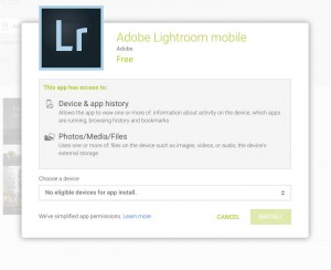
The download failed.
A message popped up with an explanation, saying I had “no eligible devices.”
What?
I have a late model HTC One Max. Surely it was powerful enough.
I doublechecked the Adobe Lightroom Mobile for Android FAQ and saw that, in fact, the HTC One Max met all hardware and software specs. So why would I get the Google Play ineligibility error prompt? It didn’t make sense.
Then I looked at the FAQ again. Wait, Adobe Lightroom Mobile for Android only works with Android smartphones. Really? Unbelievably, the text explained that Lightroom Mobile for Android doesn’t work with Android tablets yet.
Well, phooey. Why not? And why would they release it before it did? A product like this is only going to be truly useful on a large screens, for reasons I’ll get into further down. And the main reasons so many folks were waiting for it was because Adobe Lightroom Mobile for the Apple iPad is just so good.
Yes, I know the typical excuse for this silliness is “Android screen fragmentation,” but I’m not buying it.
And even though the Android device I was downloading the app on was a phone, not a tablet, I then found out that Adobe didn’t agree. My HTC One Max, with its 5.9 inch screen, wasn’t a phone but a “phablet,” in Adobe’s eyes. That’s baloney and it shouldn’t matter. I emailed tech support with the problem but that didn’t get far, either.
The rep said he’d get back to me in a week with an explanation, a comment for this story and an update.
I never heard back. But I knew any device could get around an ineligibility block if it were rooted. I didn’t want to do that for this review, but I had no other choice.
So I took matters into my own hands.
I decided to install the app via side load. I don’t recommend you do this, though. I don’t know your system and with a side load, anything can happen.
At last though, I was able install the app. With a sigh, but still some hope, I dove in.
Adobe Lightroom functionality is okay. Sort of.
To use Lightroom Mobile for Android, you need an Adobe Creative Cloud account. Creative Cloud isn’t free of course, but Lightroom Mobile for Android does offer you a free 30-day trial. Just complete the obligaotory registration form to grab an account for yourself. This will allow you to sync up projects to the cloud so you can further process photos on-the-go or on your web-connected computer. That’s a cool integration that separates Lightroom Mobile and Creative Cloud users will appreciate it.
Luckily, I am a Creative Cloud member. It wouldn’t make sense to download the free Lightroom Mobile app if you didn’t want to shell out bucks for the Creative Cloud service, would it?
Anyway, I next signed in to Creative Cloud and launched Lightroom Mobile. At first, I was pleasantly surprised.
The app looks real nice once you’re inside. The interface looked elegant. And it lets you quickly and easily access different elements of the editing workflow, all presented clearly.
But because it offers so many tools on screen, this app isn’t really right for a smartphone screen, even my 5.9 inch one. It is so badly crying out to run on a tablet.
No such luck, as I said. And what a mistake.
Moving on.
In Lightroom Mobile for Android, swiping can be dangerous
Looking at the workflow of Lightroom versus Lightroom Mobile for Android, Adobe does get the transition right. It’s quite comparable. The desktop version has a layout that leads you down an ideal editing path. So does the mobile app. That’s the good news.
Check out the screen below. Notice that the menus run vertically and downward in the desktop app. Nice. So far …
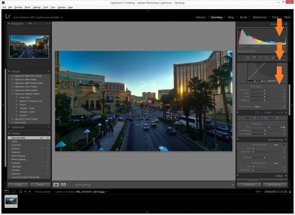
It also runs horizontally, from left to right, in the mobile app.
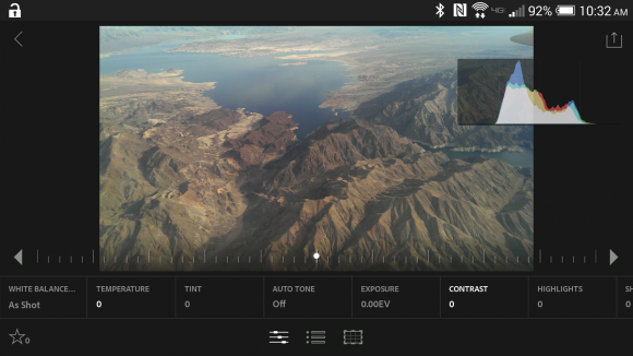
Like the desktop version, Adobe Lightroom Mobile for Android makes available some quick and handy presets.
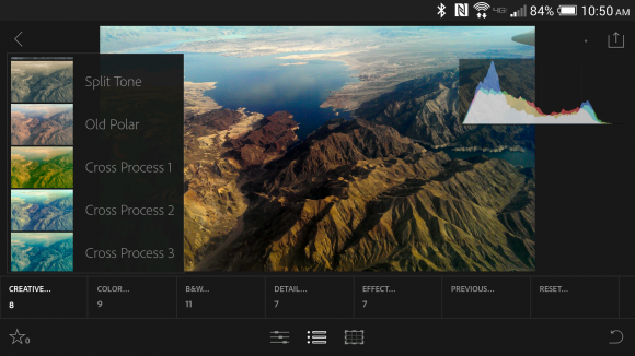
In the mobile app adjustment area, you manipulate elements by tapping on the arrows to increase/decrease the intensity of an effect. You also are able to just swipe from left to right.
Be careful, though. Swiping from left to right may accidentally throw you into another photo in your imported gallery.
Unfortunately, the accidental swipe is too easy to do in Lightroom Mobile for Android — on a phone, I mean. Clearly, a tablet with a larger screen — larger than my 5.8-inch phablet screen — is needed for this specific kind of functionality. It bears repeating that having Lightroom Mobile for Android not work with tablets on first release is just so strange — and witless, too.
Adobe for sure could’ve waited a little while longer for release to make sure that tablets would work with Lightroom Mobile, too.
Alas, no aspect free cropping
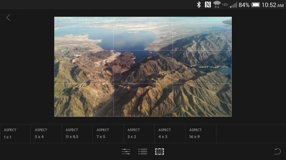
Another issue I had with Lightroom Mobile for Android doesn’t have an option for aspect free cropping. All cropping is set to static aspect ratio. This is at once inconvenient and strange. This feature is standard in other mobile photography apps. Again, what is Adobe thinking?
Bottom line: Should you get Lightroom Mobile for Android? Um …
Well, it is free. And you get what your pay for. Many folks will find it to be a nice, free mobile alternative to a powerful photography editor they already like. If they have a smaller than 5.9-inch screen, no tablet, no worries about accidental swiping, and no aspect free copying.
And remember the granular editing capabilities I longed for, the ones that my favorite smartphone photo editing tool, Snapseed, doesn’t offer? The feature that made me so eager to get Lightroom Mobile for Android and review it when it finally came out?
They’re not even there. Heck, Snapseed for Android offers more more granular editing tools than Adobe Lightroom Mobile for Android, and it doesn’t seriously scratch the surface of what I hoped for.
And you really do need a large, tablet-sized screen to run this app well. I just hope Lightspeed Mobile for Android’s next revision will work with tablets — and that it fixes the other problems I identified in this review, too.
Adobe, take note. Why would anyone switch from Snapseed to get a less capable app that doesn’t even run on Android tablets? People won’t switch from Snapseed or another app just because it’s made by Adobe, especially not when their apps are more feature rich and work with tablets. Perhaps execs didn’t realize what smartphone photo enthusiasts would want to use your tool for? Two words, people: use cases.
Sheesh.
Better luck next time, Adobe.
For aNewDomain, I’m Ant Pruitt.


