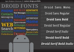
aNewDomain.net — Fonts play an important role in the mobile customer experience and legibility should be a priority no matter what language is being displayed.
The barn doors of CES are barely closed and Mobile World Congress looms on the horizon. How might one mobile manufacturer differentiate itself from the next? Partly by being the right type. The right typeface, that is. And while the current trend is to offer slightly-larger phablet-type phones, Google wants to make sure that text is approachable and just a bit playful even on the smallest Android-based mobile devices.
Enter Steve Matteson, designer of the Droid family of fonts and Creative Type Director of Monotype, a brand that’s been around for more than a century. Monotype acquired the type foundry Ascender Corporation where Matteson initially created the Droid fonts in 2010 bringing along with them a portfolio of their typefaces featured on everything from the Windows 7 phone to the Xbox 360. Just in case you want to get into the small print, the font business is pretty big: Monotype has 350 employees around the world, is publicly held and their 2012 revenue was $149.9 million.
Matteson originally embraced type amidst printing presses and metal type as a student at the Rochester Institute of Technology. We asked Matteson about the letterform personality that Google was looking for in Android and Chrome OS.
How is type different on electronic devices and how do you design for the different platforms?
Each platform has unique characteristics from screen pixel density to the software used to display words as pixels. These may vary so much that some font designs simply won’t function optimally on all platforms. With print on paper you often have four times the number of pixels to render all the details of a letterform. On screen, not only are there are fewer pixels but brightness and contrast are issues as well.
What gives font a personality?
Typefaces draw their personality from a number of variables — boldness vs. lightness, wide vs. narrow proportions, upright vs. slanted stress, uniformity vs. nuance. Droid Serif, for example, is upright in stress giving it a degree of formality. This is softened by the swelled tips of ‘y’ and ‘s.’ In fact, because Google wanted it to be a fairly narrow font for fitting more text on small screens, it needed quite a bit of softening to prevent it from looking uptight and cramped.
How is the Google personality expressed in the Droid font?
These are ‘serious,’ highly legible designs for reading at a glance, yet they retain some non-uniformity and softness like the Google brand itself. They are not cartoonish — nor are they stodgy.
Why are fonts important?
Typeface choice is quite important because of the visual language letters contain. The typeface can either reinforce your message, convey it in a completely neutral manner, or obfuscate the meaning entirely. Extreme examples might be a wedding invitation typeset in a typewriter typeface rather than an elegant script or a bank statement set in a typeface used by a competing firm.
It takes a team to develop a font, says Matteson. Aside from the actual letterforms — how they are drawn and fitted together — there is a software element to fonts which allows them to install and function within computing platforms. As mentioned earlier there are nuances among screens which can be accounted for within the font software as well as code which allows multiple languages to be supported by the font. Monotype has a large staff of experts to turn to for the design, software and linguistic elements required for properly functioning fonts.
What is the step-by-step process of designing a font?
Typeface designs take their inspiration from many different things. For me there is always a sense of utility or purpose to my work usually in the form of a design brief from a customer. Pencil and paper are almost always the starting place — even for an intensely digital product like the Droid fonts. Drawings are digitized using vector-based font design software. As early as possible the resulting shapes are tested in the environment they were intended for. In the case of the Droid fonts we placed them into sample user interface screens to check for legibility, the contrast of light and dark and general artistic proportions. It then becomes an iterative process of making changes and proofing until the results are satisfactory.
How does a team work together to design a font?
There are many scenarios but the most common is the design portion is handed off to engineers who make sure the software aspect is fully functional. We also have a team of people who do quality assurance testing which may involve installing and testing the fonts in unreleased mobile products.
Monotype licenses its fonts to developers and creative professionals and is home to such world-famous typefaces as Helvetica. In December 2013 the company created a way for anyone to play around with fonts in documents for a limit of five minutes. Monotype’s SkyFonts client enables this freedom on the Fonts.com site.
We’re even hearing that soon consumers will be able to specify the components they want in their phones. Most mobile device makers wait till Mobile World Congress in late February to truly strut their stuff, but many Chinese and Taiwanese phone vendors introduced Android phones of varying sizes for sale in and outside the U.S. this week. Let’s hope that they put legibility at the top of their list.
By the way, all is not Android for Steve Matteson. Some artists paint landscapes. As for Matteson he caught the form of the Sierra Nevada mountains in his Massif typeface family.
Want to know more about fonts? Check out this great movie about Helvetica. You’ll never look at a New York subway sign the same way.
I’m Pat Meier-Johnson for aNewDomain.net.


