aNewDomain — If you’re a frustrated Windows 8.1 user and still gun shy about upgrading to Windows 10, check this out. Here’s my list of the four most annoying Windows 8 features that Microsoft has killed off in Windows 10 — and replaced with something better.
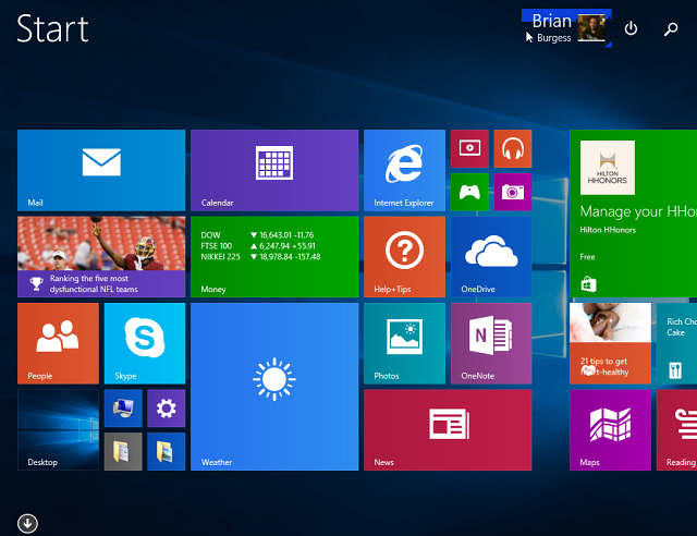
1. The Start screen is gone. And the Start menu is back …
One of the most intimidating and annoying Windows 8 features was that it booted you directly into its weird new Start screen. It was okay if you had a tablet or other mobile device, but on a traditional PC with keyboard and mouse it sort of sucked. Worse, the company stripped away the Start menu.
Microsoft fixed the issue “sort of” with the Windows 8.1 update and by returning the Start button, but they didn’t bring back the full menu. Now, in Windows 10, the Start menu has been returned which provides familiarity and also incorporates live tiles that were a big part of Windows 8.
2. Exit: Charms Bar. Enter: Action Center
Much to the pleasure of Windows 8.X users, the Charms Bar is gone and is never to be seen again. When Win 8 launched, Microsoft execs kept listing the dorky Charms Bar as one of its best new features. But it was really designed for touchscreen devices. Desktop users hardly ever used it, which didn’t stop the Charms Bar from popping up at inconvenient times and just generally getting in the way. Good riddance, Charms Bar.
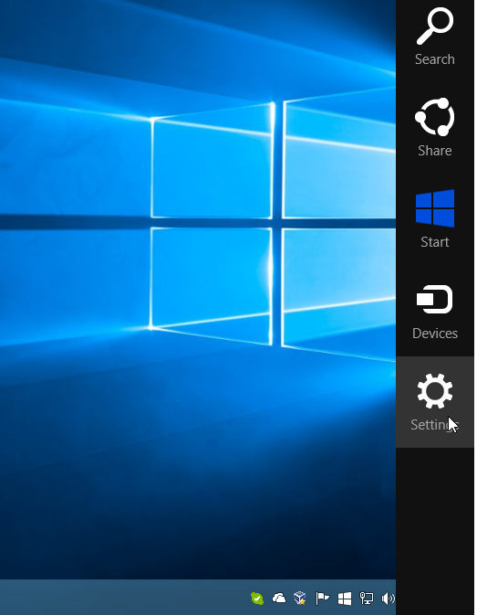
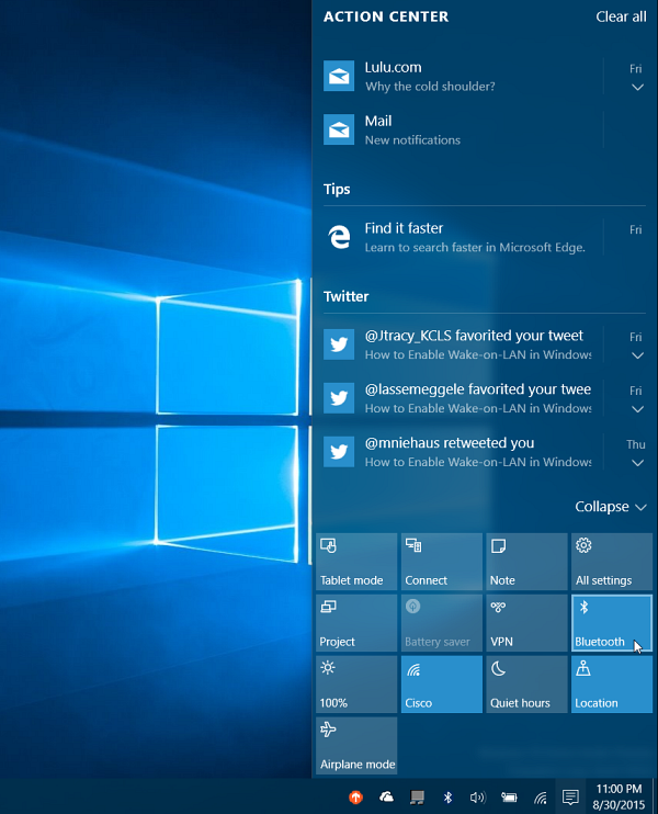
And here’s even better news: Microsoft has replaced the Charms Bar with something genuinely useful in Windows 10. It’s called Action Center. Here you get notifications for things like email, Twitter, system notifications and other app info. It also gives you easy access to system settings via quick action tiles that you can toggle on or off. Nice. Check out Action Center, below.
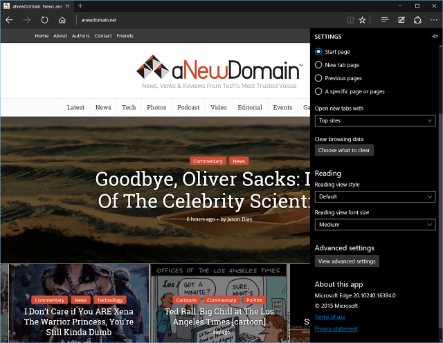
3. Two versions of IE in Windows 8 give way to Microsoft Edge. Thank you.
Windows 8 had two versions of Internet Explorer. One was a modern version geared toward touch devices, and the other was a traditional desktop version. But the whole setup was schizophrenic. In Windows 8.X, when you tried to open a link, you often didn’t know which of the two versions was going to come up. Thankfully, that dumb arrangement is gone in Windows 10.
Now, not only are both versions of Internet Explorer gone, but Microsoft is replacing the crusty old IE entirely with its new browser, Microsoft Edge.
Edge is responsive, fast and much more intuitive than any previous version of Internet Explorer. It’s worth noting that IE 11 isn’t yet completely gone from Windows 10, though. It’s still there if you need it, and you might for legacy sites or proprietary enterprise services that require it. But the rest of the time and for the rest of us, Microsoft Edge is the default web browser in Windows 10. Applause.
4. Full-screen Windows apps are gone, too. Now they’re in resizeable floating windows …
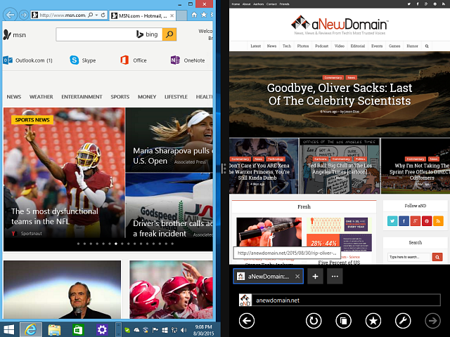
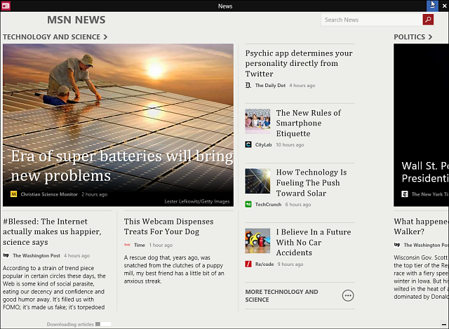
By default, Windows 8 apps would launch full screen and there was no way to resize them. While the Windows 8.1 update did add a title bar with a minimize and close button, the full-screen bit made it difficult to manage two environments.
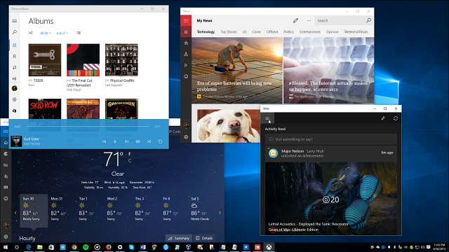
Windows 10 built-in apps — now they’re officially called Universal apps –are resizeable. Better still, they’re easy to work with even on non-touch PCs with mice and keyboards. They work like you’d expect any app you would use on the desktop.
These are the most notable annoying features that are killed off in Windows 10, and there are many more reasons you should upgrade Windows 8.1 to Windows 10. My colleague Sandy Berger lists 10 Reasons to Upgrade to Windows 10 here. Enjoy.
For aNewDomain, I’m Brian Burgess.


