
aNewDomain.net — According to a new study from ABI Research, by the end of 2013 smartphones running the Google Android mobile operating system versions will number nearly 800 million. That’s compared to about 300 million Apple iOS devices predicted to be in the market by then. The research shows Android versus Apple iOS compared — in terms of market share — and there’s a lot more to the story here.
As analysts point out, the growth is stellar for Android, but 2013 won’t be as big a year for Google Android as 2012 was. How big was that? Check out this Android versus Apple iOS infographic from MBA Online.
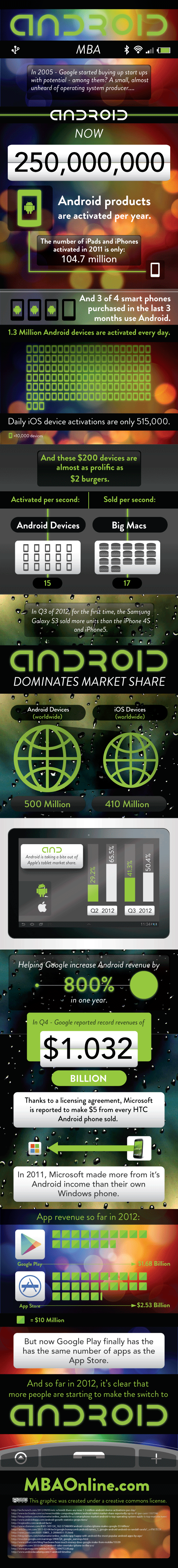
Credit: Android by MBAOnline.com is licensed under a Creative Commons Attribution-NonCommercial-NoDerivs 3.0 Unported License
According to AB Research, current bit player devices running Windows Phone and the new BlackBerry 10 OS will begin to make a dent in 2013 when all is said and done. We’ll see. In 2013, the researchers say there will be more than 1.4 billion smartphones out. Of those, the study predicts 45 million Windows Phone devices and 10 million BlackBerry 10 based smartphones by year’s end. VentureBeat has a nice perspective piece on all this up on its site right now.


Where can I get a Bic Mac for $2?
First smartphone HTC windows…2 weeks later gave it away…samsung android always. Android Tablets! Everyone I know w an ipone has a cracked screen & it is limiting. Those numbers represent free-market choices!